Widget
Setup
- Make sure the widget feature has been enabled and set up on your Video Banking platform.
- Append this script to the <head> of your FI website‘s DOM.
Required:
<script>
(function(i,n,v,o,s,l,t){
i[o+'URL']=s;i[o]=i[o]||{init:function(){i[o].q=arguments}};l=n.createElement(v);
t=n.getElementsByTagName(v)[0];l.async=1;l.src=s+'/js/widget.js?id='+Date.now();t.parentNode.insertBefore(l,t);})
(window,document,'script','InvoWidget','https://url.to.the.vb.website');
Optional customization:
InvoWidgetOptions = {
btnSize: “80px”, //Button size
// Custom Colors, terms defined between the square brackets are reserved for string values, the square brackets should be removed
primaryColor: “[color1]”,
succesColor: “[color2]”,
warningColor: “[color3]”,
// Custom loading
loadinGIF: “[url-to-the-custom-loading-gif]”,
loadingSize: “200px”,
// Custom icons
icons: {
[iconKey]: “[icon-svg-path-description]”,
[iconKeyBis]: {
src: “[path-to-the-image]”,
scale: “fit”
}
}
</script>
Required:
- In the <body> of your FI website’s DOM, add this tag.
<invo-widget/>
Customization
1. Feature customization
There are currently 3 features supported by the Widget:
- Chatbot: Offering an interface for end-users to interact with the FI through a chat interaction.
- Booking: Offering an interface for the end user to schedule an appointment
- VB: Showing button linked to the video banking website.
By default, the widget is designed to show all the available features. For example, if the FI has Video Banking and Chatbot but not Booking, the widget will show buttons to access the VB and the Chatbot features.
For any reason, if the FI wants to enable only a given set of features for the widget, just list all the expected features into the invo-widget's modules parameters and separate them with a |.
2. Wording customization
Wording customization is not available until Core VB platform is updated to version 4.4. In 4.4 and above, we allow the FI to easily customize the widget’s wording through our Verbiage Customization module. All the widget’s wording would be defined in the invoWidget namespace.
For Core versions before 4.4, please submit a ticket with all the expected changes for widget wording to our support team, then our engineers will build a custom one for your institution.
3. Colors customization
The primaryColor is the default color for buttons and window headers.


The successColor and warningColor are respectively used for customizing the color of the Confirm ( ) and Delete(
 ) buttons in the screen below.

4. Booking loading UI
Between the different steps of the booking module, we have a loading screen. You can customize the loading UI as well by replacing the default loading gif with your preferred one. You need to have your GIF file accessible publicly via a URL. Set the URL as the value of loadingGIF parameter in the InvoWidgetOptions object. The loadingSize parameter is useful for adjusting the size of the loading image.

5. Styling customization
The widget is loaded into a website that your FI owns. You can add dedicated CSS styling codes to your DOM to overwrite our styling presets.
6. Icons customization
Some icons used in the widget can be customized as well by specifying an SVG-path-description in the icons section of the InvoWidgetOptions object. The list of customizable icons are as follows:
- plus: the icon which shows by default is a plus sign, used to show widget options when the cursor is hovering on the widget.
- Others include “minus, cancel, confirm, close, minimize, calendar, warn_triangle, chat, phone, vb, in_branch_video, in_person”
a. Using a published image with default round border
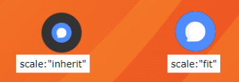
If you have an image (PNG, JPEG, GIF..) uploaded somewhere on the internet (cdn for example), and you want to use it as an icon in the widget, the only thing you need is the URL to the image and to declare the given URL in InvoWidgetOptions. The snippet below show 2 examples of how to customize the chat icon.
- Example 1 shows how to fit the icon inside the button by tweaking the scale parameter
- Example 2 is equivalent to example 1 but with the scale parameter set to fit
InvoWidgetOptions = {
// example 1
icons: {
chat: https://demo.invosolutions.com/images/chat-icon.svg,
}
// example 2
icons: {
chat: {
src: https://demo.invosolutions.com/images/chat-icon.svg,
scale: “fit”
}
}
</script>
b. Using SVG-path description
The SVG-description for the icon is defined as the value of the d parameter, which describes a path defined in a 64-by-64 viewbox SVG. The icon will be embedded in the DOM as follows:
<svg viewBox="0 0 64 64">
<g>
<path d="svg-icon-description"></path>
</g>
</svg>
For example, the chat icon  would be embedded as follows:
<svg viewBox="0 0 64 64">
<g>
<path d="M 52.3 57.8 c -13.4 3.3 -23.2 -5 -23.2 -13.8 c 0 -8.5 8.3 -14.6 17.5 -14.6 c 9.2 0 17.5 6.2 17.5 14.6 c 0 3 -1.1 5.9 -3 8.2 c -0.1 2.7 1.5 6.5 2.9 9.3 c -3.8 -0.7 -9.2 -2.2 -11.6 -3.7 z m -28.6 -13.8 c 0 -11 10.2 -19.9 22.8 -19.9 c 2.4 0 4.6 0.3 6.8 0.9 c -0.1 -12.9 -12.7 -22.2 -26.7 -22.2 c -14.1 0 -26.7 9.4 -26.7 22.3 c 0 4.6 1.6 9 4.5 12.5 c 0.1 4.1 -2.3 9.9 -4.4 14.2 c 5.8 -1 14 -3.4 17.7 -5.6 c 2.1 0.5 4.2 0.8 6.2 1 c -0.2 -1 -0.3 -2 -0.3 -3.1 z"/>
</g>
</svg>
Useful resources: https://yqnn.github.io/svg-path-editor/
c. Using a published image with a custom class
Parameters:
- The “src” property of each icon will override the default icon for the widget element.
- If a class name is specified, it will assign a class to the widget elements.
For one widget element
- Example:

- Code example:
// Script code
InvoWidgetOptions = {
icons: {
chat: {
src: "https://w7.pngwing.com/pngs/1001/63/png- -sticker-electronics-face-careobot.png",
class: "invo-widget-chat"
}
}
// Setup custom styles
.invo-widget-chat {
margin-top: auto;
margin-bottom: auto;
}
.invo-widget-chat > img {
width: 2rem;
height: 2rem;
padding-left: 0.2rem;
padding-right: 0.2rem;
}
For two widget elements:
- Example:

- Code example:
InvoWidgetOptions = {
icons: {
chat: {
src: "https://w7.pngwing.com/pngs/1001/63/png-sticker-electronics-face-careobot.png",
class: "invo-widget-chat"
},
calendar: {
src: "https://www.vhv.rs/dpng/d/215-2152946_-appointment-icon-png-transparent.png",
class: "invo-widget-booking"
}
minimize: {
src: "https://toppng.com/uploads/preview/minimise-11551049819kkxdkjjm6p.png",
class: "invo-widget-minimize"
},
plus: {
src: "https://w7.pngwing.com/pngs/100/522/png-transparent- -signs-sign-thumbnail.png",
class: "invo-widget-plus"
}
}
// Setup custom styles
.invo-widget-chat, .invo-widget-booking, .invo-widget-minimize, .invo-widget-carousel {
margin-top: auto;
margin-bottom: auto;
}
.invo-widget-chat > img, .invo-widget-booking > img, .invo-widget-minimize > img, .invo-widget-carousel > img{
width: 2rem;
height: 2rem;
padding-left: 0.2rem;
padding-right: 0.2rem;
}
For three widget elements:
- Example:

- Code example:
InvoWidgetOptions = {
icons: {
chat: {
src: "https://w7.pngwing.com/pngs/1001/63/png-sticker-electronics-face-careobot.png",
class: "invo-widget-chat"
},
calendar: {
src: "https://www.vhv.rs/dpng/d/215-2152946_-appointment-icon-png-transparent.png",
class: "invo-widget-booking"
},
vb: {
src: "https://cutewallpaper.org/24/video-icon-png/png-play-3570982-pinclipart.png",
class: "invo-widget-vb"
},
minimize: {
src: "https://toppng.com/uploads/preview/minimise-11551049819kkxdkjjm6p.png",
class: "invo-widget-minimize"
},
plus: {
src: "https://w7.pngwing.com/pngs/100/522/png-transparent- -signs-sign-thumbnail.png",
class: "invo-widget-carousel"
},
setting: {
src: "https://www.citypng.com/public/uploads/preview/hd-settings-background.png",
class: "invo-widget-setting"
}
}
// Setup custom styles
/* Used for chatbot, vb, booking and minimize icon */
.invo-widget-chat, .invo-widget-vb, .invo-widget-minimize, .invo-widget-booking {
margin-top: auto;
margin-bottom: auto;
}
.invo-widget-chat > img, .invo-widget-vb > img, .invo-widget-minimize > img, .invo-widget-booking > img{
width: 2rem;
height: 2rem;
padding-left: 0.2rem;
padding-right: 0.2rem;
}
/* Used for carousel when using all vb, booking and chatbot || when two components for plus style*/
.invo-widget-carousel > img{
width: 2rem;
height: 2rem;
padding-left: 0.2rem;
padding-right: 0.2rem;
}
/* Used for setting when not specifying language */
.invo-widget-setting > img{
width: 2rem;
height: 2rem;
padding-left: 0.2rem;
padding-right: 0.2rem;
}
d. Additional widget customization features
The widget icons can be additionally customized to suit the needs of the FI using the following:
.widget-icon {
border: none;
padding: 0px;
margin: 0px;
transition: ease .5s;
border-radius: 10px;
overflow: hidden;
}
.widget-icon:hover {
scale: 1.05
}
.widget-icon > img {
height: 60px; /* Customize icon height here */
cursor: pointer;
object-fit: cover;
}
.w-row {
display: flex;
flex-direction: row;
}