In this article:
Marketing Campaigns
Marketing Advertisements
Invo Core/Web Branding
Invo Kiosk Customization and Branding
Invo Chat Branding
Marketing
Setting Location - Marketing tab
Campaigns are a series of advertisements that will be shown to your clients based on different criteria.
- When a client enters a video queue
- When the client is placed on hold
- While an Invo Kiosk is idle
You have the ability to display specific campaigns on either Kiosk, Web, or Mobile channels, or all 3 simultaneously.
You also have the ability to have a specific campaign display on certain Queue Answers. For example, if you are running a Mortgage promotion, you can have that campaign display for your Mortgage queue, but your Lending queues will never see it.
Clicking the gear button under Action will bring up the Campaigns submenu. Here, you can title your Campaign, select which Queue Answer(s) you prefer, which Language, image transitions if applicable, and the default duration of images. This will determine how long images will remain on the screen before transitioning. You can also schedule campaigns. For example, if our above Mortgage promotion was only for the summer, you can schedule that campaign to end on a specific day, and schedule a new campaign to take its place the next day.

Advertisements can be a variety of types. They can be images/stationary ads, music, or video. There are no restrictions to format type
New advertisements can be added by clicking the plus sign in the top right corner of the Advertisements section, browsing to your ad, giving it a Title, and clicking 'Submit'.
There are two additional settings that are related to Marketing, located at Admin > Manage Settings > Marketing.
Max advertisement file upload size - This can be increased up to 128mb, but will require a ticket to our support team to change.
Ads Campaign Background - This will display in the background behind your add. It also requires CSS styling.
Branding
Core/Web
Setting Location: Admin > Manage Settings > Branding. Favicon - This is a small image that will appear in browser tabs. The ICO format would be best suited for it, but it can be also JPEG or PNG. The recommended size is 16x16.
Logo - This is used almost everywhere in the platform to represent the FI.
- In the navigation bar
- The watermark shown on the video stream
Slogan - This is the long/big/more-detail version of the logo. If it is not defined, the system will use the Logo instead as a fallback option. The Slogan is used in:
- In the survey form
- On the web landing page
- On the booking status page
- On the document uploading page
An image with a transparent background would be recommended. Your logo must stand out on dark/light backgrounds for our dark/light modes. See the images below:
If your logo cannot stand out from one of those two backgrounds, it is recommended to add some color, shadow of backdrop into the background of the images.
The recommended format is PNG. There is no constraint on the size or the resolution for those images. In general, for online purposes, your logo size should be under 200 KB. The larger your image file is, the heavier it is, which makes it more challenging for websites.
Here are the standard measurements for the size of the logo:
Vertical layout:
- 160 x 160
Horizontal layout:
- 250 x 150
- 350 x 75
- 400 x 100
Welcome Image - This image will appear at the login page for your Agents.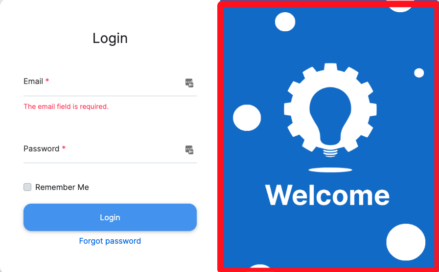
1. Web Landing Portrait Image - This is an image that will appear on your client facing web page. It is portrait orientation, and typically is either a logo, or a targeted advertisement.
2. Web Background - This can be a solid color, an uploaded image, or a URL. This will be the entire background of your client facing web page.
User profile image - This image is typically either the users standard company photo, or an avatar image.
Kiosk
Setting Location: > Admin > Manage Settings > Kiosk > Kiosk Customization
You do not have to be in front of a Kiosk to review your customization. To preview the Kiosk, under Admin > Manage Settings > Kiosk, there is a Kiosk Toolset on the right side that is home to the Preview Kiosk option. You can preview the kiosk up to actually placing a call.
Images
In call background image - This image will be sitting behind the call window for the Kiosk.
It is NOT a virtual background.
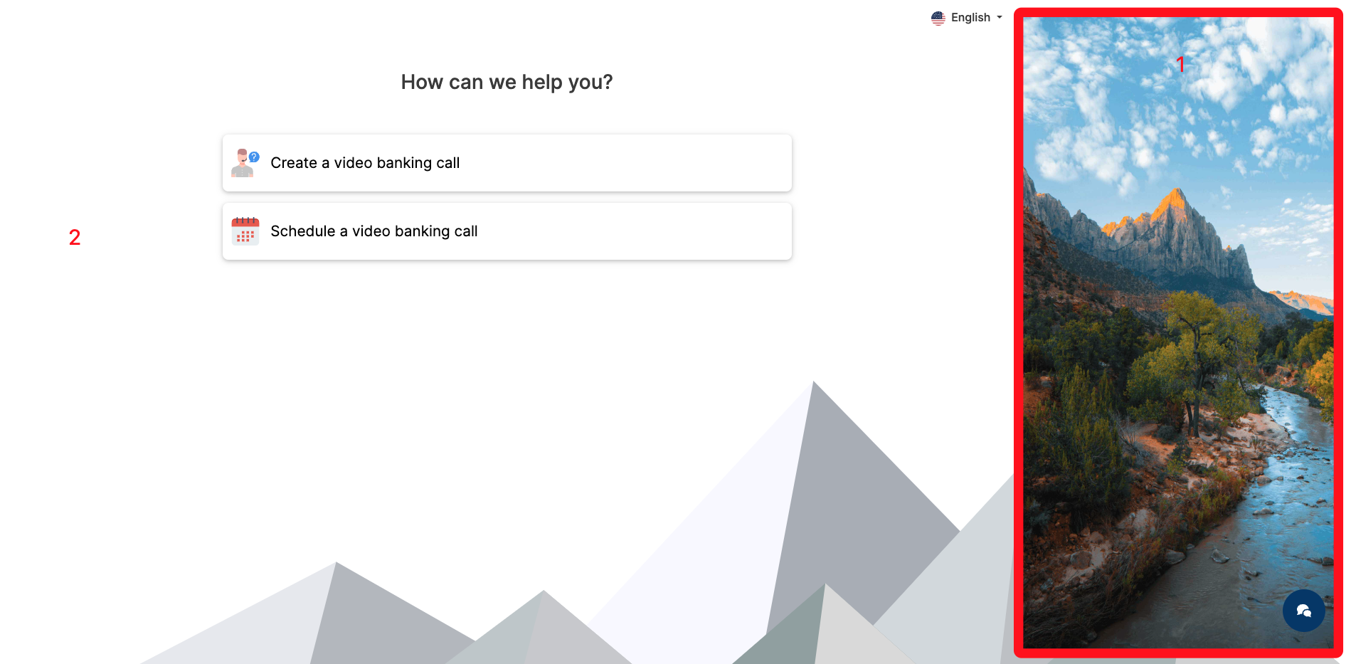
Create call background image - This image will be displayed when your clients are making their selection for the queue.

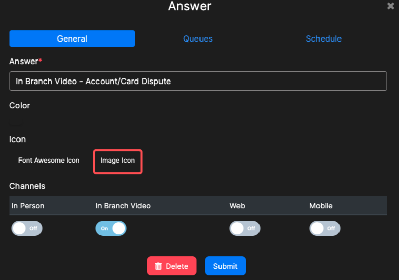
Your Queue Answer buttons (the three displayed above) can have an image or your logo on them if you choose. However, this has to be done under the Queue Answers menu, under Admin > Queues. Click on an Answer, then click Image Icon. NOTE: If you have multiple channels selected for the Answer, this image will show up under those selections as well.
QA Buttons
Position of the Create a Call button - You can modify where the Create a Call button will be located. The Create a Call button will initiate the process, taking your clients to the Queue Button selection screen.
Create call template - you can select to either use the QA buttons, or the user info form. This is the same form that is on your client facing web portal.
Show more QA buttons - this will enable another button that will display as a plus sign that will extend out to other Queue options.
Max number of QA buttons - this is the number of QA buttons that will display on the Kiosk at one time.
QA buttons have QA name - you can chose to disable the text on the Queue buttons.
QA button size - you can customize the size of the buttons.
QA button arrangement -
Bottom - buttons are curved and at the bottom of the screen.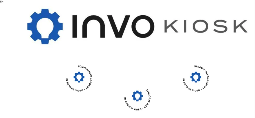
Center - buttons are in the center in a straight line.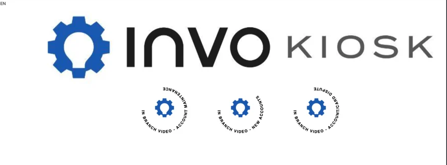
Horizontal - buttons are at the bottom in a straight line.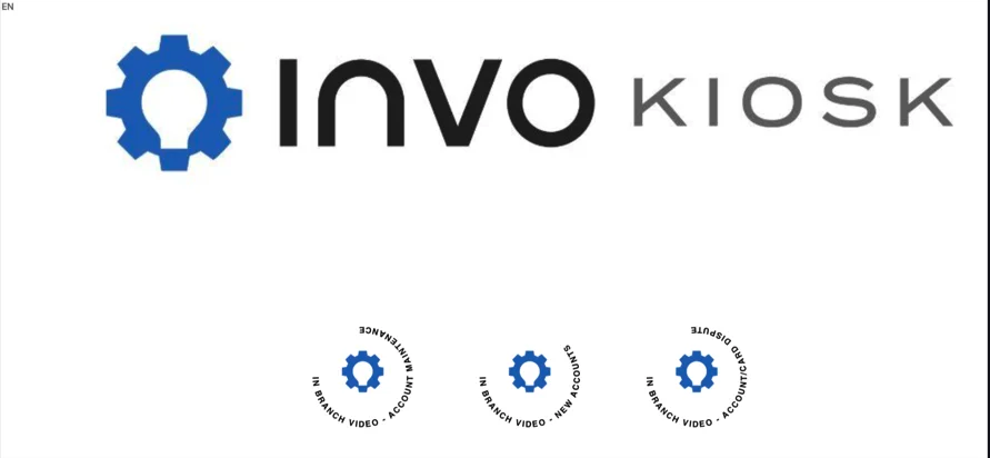
QA button background color - if you chose to have a background image, we suggest this option be set to "none" in order to correctly display a png image. If you do not have an image, you can type the name of whatever color you choose into the option.
QA button text color - if you chose to display the text/names of the QA buttons, you can customize the color for it.
Invo Chat
Setting Location: Admin > Manage Settings > Messaging Services > INVO Chatbot
Launcher Icon Replacement Image
This is the chatbot icon image that is displayed on your web landing page.
NOTE: This is not the Widget image that would be placed on your website. Please click here for more information concerning our Widget.
Appearance
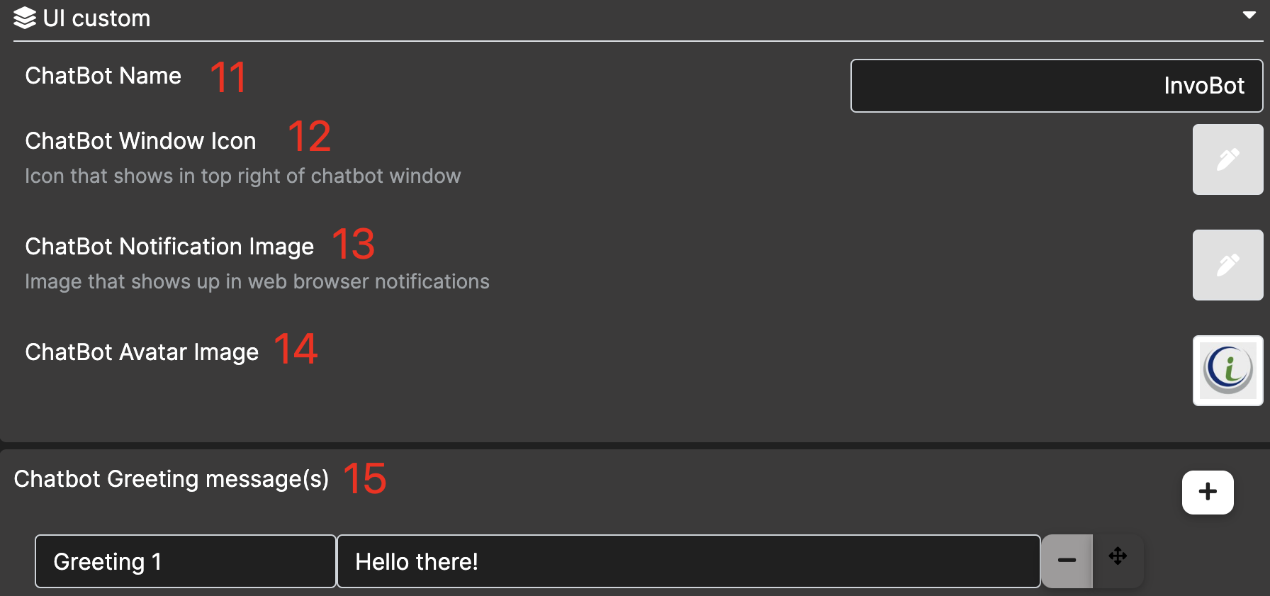
11. Chatbot Name
Change the name of chatbot, which will show on the header of the chatbot.
12. Chatbot Window Icon
Change the Icon that shows in the top left of the chatbot window.

13. Chatbot Notification Image
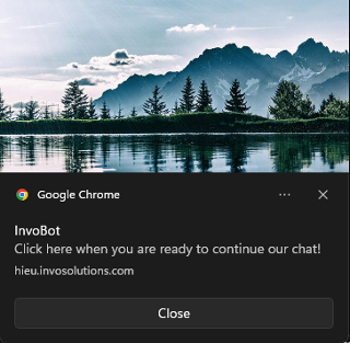
Image that shows up in the web browser notifications.
14. Chatbot Avatar Image - Depreciating soon
15. Chatbot Greeting Message(s)
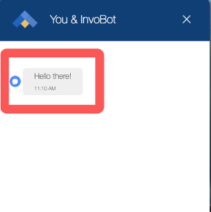
Show greeting messages to customers when they start chat conversation with chatbot.
External Survey Link
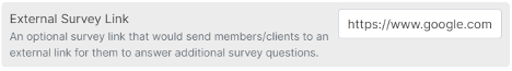
This provides the ability to have the survey that is your customers can choose to fill out at the end of an interaction come from an external source.